I don't know how I missed including this picture in my last posting on White Bedrooms.
Shabby Chic via Cote de Texas Cote de Texas describes this picture as: Gustavian and Shabby Chic - the new combination. I would love to sleep in this bedroom!!
Patricia Gray writes about Interior Design inspirations, emerging trends, and the world of Design. While you're here, subscribe to this feed so you don't miss out.
Nothing is more timeless, serene and restful than WHITE ON WHITE in a bedroom. I grew with a white bedroom and I can still remember the quality of light that came through my white curtains as the morning sun was rising. When I design an all white room I use several shades of white to bring out the architectural details, or I layer the space with strong forms in different tones and textures of white and then use some strong contrasts to outline and bring the white into focus. Every room no matter what colors are being used can benefit from a touch of black. Some of my favorite whites I use are are from Benjamin Moore: Cloud White, Simply White, Ballet White and Designer White. My all time favorite is Cloud White. I like it because it has a chameleon effect and it is a very soft. Not every white is snow white. Try using: ivory, cream, antique white, and palest beige, blue and yellow.
I like the way that Thomas Pheasant has treated this bedroom architecturally. The wrap around tufted low headboard creates a unified feeling to a room that has angled walls.
Vicente Wolf is a master at juxtaposition. His signature element in all of his rooms is a large over sized mirror, usually resting on the floor.
This is a Master Bedroom that I did for a client, which was in a Heritage building, in Vancouver's historic Gastown. There are recessed sliding glass doors on each side of the bedroom to close it off from the dining room on one side and the ensuite bathroom on the other side.
Mimmi O'Connell I love the Campaign bed used here and also the textured white carpet.
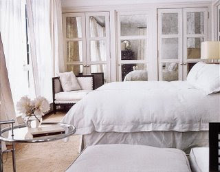
Thomas O'Brien I like the use of paneled mirrors on the closet doors.
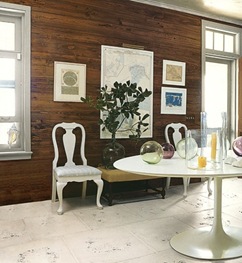
Right now I am loving the cleanness of this table designed by Eero Saarinen in 1956. It has really stood the test of time and is now considered a "Design Masterpiece". I will never forget in Design School we had to do a two-point perspective rendering, hand drawn, of this table (the elliptical version) with 6 chairs with the same base around it. I hated that base for years, but I have finally come to terms with the beauty and versatility of the design. I particularly like the quote below by Saarinen and the fact that he referred to the legs of tables and chairs as "a slum of legs". As a designer I can totally relate to that. It is always a challenge to pay attention to the detail of "legs".
Knoll Saarinen Table
"The underside of typical chairs and tables makes a confusing, unrestful world,"
said esteemed Finnish designer Eero Saarinen.
"I wanted to clear up the slum of legs." Design Year: 1956
Knoll Saarinen Table Diamond Baratta
Knoll Saarinen Table Eric Piasecki Photography (left) Dominio (right)
I have come across a wonderful artist who writes a blog called Fifi Flowers. She was inspired to do a drawing by a picture I posted recently on my inspirations on Patio Furniture. I love what she has done and I never cease to be amazed at the different things that trigger the creative process in each of us.