Kamis, 03 Februari 2011
On my love of blue.
Selasa, 01 Februari 2011
Red, White and Turquoise
Kamis, 27 Januari 2011
Black Walls: A Lasting Trend?
Jumat, 10 Desember 2010
2011 Color of the Year: Honeysuckle
Kamis, 23 September 2010
Natalie Umbert makes me happy.
Rabu, 12 Mei 2010
Favorite New Color Combo: Coral & Blue
Selasa, 04 Mei 2010
Style Essential: Turquoise Lamps
Kamis, 22 April 2010
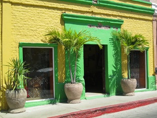
The Colors of San Jose del Cabo
The Colors of San Jose del Cabo


Patricia Gray Inc is an award winning Interior Design firm in Vancouver, Canada who blogs about WHAT'S HOT in the world of Interior Design.
2010 © Patricia Gray | Interior Design Blog™
Selasa, 30 Maret 2010
Passion for Purple
Rabu, 17 Maret 2010
Going Green
Jumat, 19 Februari 2010
A Craving For Citrus
Senin, 15 Februari 2010
Weekend Update: Going Turquoise
Rabu, 10 Februari 2010
Pink: It's The Color of Passion
Selasa, 09 Februari 2010
Reinventing Blue
And I mean a deep, dark, luscious Blue. It is showing up in walls, fabrics, carpets and accessories. It is a blue that doesn't have green or red in it. It is almost black and is warmer than lighter blues and has more life and depth than Black. It is the deepest shade of Indigo as seen in Ikat Textiles. It is the color of the sky on a moonlit night. It is mysterious, moody, classic, timeless, calming, and refreshing. It can have a glossy finish or be totally matt. It is beautiful when contrasted with pure white. My favorite Benjamin Moore paint colors are Polo Blue, Blackberry Punch, Kensington Blue, Blue Gaspe, Hale Navy, and Old Navy. Some deep blue colors are: sapphire, azure, beryl, cerulean, cobalt, indigo, navy, royal, midnight blue, slate, steel blue, Prussian blue.
The high gloss finish on this wall has a subtle reflectivity to it that changes at different times of the day and literally sparkles at night.
Alberto Pinto has used a deep blue in the bold geometric carpet as his only color in this wonderful Master Bedroom.
A deep and refreshing Mediterranean blue has been used on the walls at JK Capri Hotel in Italy.
A deep "French Blue" velvet for this classic chair.
I am in the process of designing a guest bedroom and I have chosen a deep blue silk for the curtains called Moonlight. I am putting a natural woven raffia roman shade on the window behind the curtains for some textural interest. The walls will be painted the same shade as the silk curtains: Benjamin Moore "Blue Gaspe". The Headboard is a heavy white Belgium linen. The bedding is white Egyptian cotton with an Hermes cashmere blanket in a deep charcoal color on the end of the bed. The carpet is wool and is the color of white coral. I will hang black and white "ocean" photographs that I have taken on my travels on the blue walls to finish it off.
Let me know if these deep luscious shades of blue are slated to become one of your new favorite colors?
Photo Credits from top: Dominio, Alberto Pinto, JK Capri Hotel, Jayson Home.
PATRICIA GRAY INC is an award winning interior design firm writing about lifestyle and
WHAT'S HOT in the world of interior design, architecture, art and travel.
2011 © Patricia Gray | Interior Design Blog™
Selasa, 02 Februari 2010
2010 Color Reform Trends
ABC Carpet & Home Vintage 'over-dyed' carpets
ABC CARPET NEW YORK INTRODUCES COLOR REFORM TRENDS COLLECTION TO SALVAGE OLD RUGS
I got an interesting email from ABC Carpet & Home New York this week, that captured my interest - they (ABC Carpet & Home) is encouraging us to look on the bright side for 2010 with a their new rug collection that promises to: "escape predictability, embrace the unconventional, and help preserve our planet." This new assortment of hybrid carpets called Color Reform, transforms imperfect, vintage rugs into modern works of art. ABC Carpets are literally “...rescuing carpets from the “rug graveyard” and giving them a new lease on life.”
ABC Carpet & Home has utilized this notion to develop the concept of Color Reform, which refers to evolutionary change through color. Each one of a kind rug was individually handcrafted by Turkish artisans in the Toros Mountains. The vintage rugs are neutralized to remove their original color and then over-dyed to create their remarkable chromatic state. The variations in the tonality of pigments result from the carpet’s original concentration of color combined with the dye application process conceived from each artist’s distinct vision.
Exotic rainbow hues range from neon pink and electric green to opulent reds and saturated yellows. The striking compositions evoke an almost translucent appearance as irregular, partially faded motifs emerge through the color, adding complexity and interest to each piece. Below is one of my favourites in the series, in a more neutral color palette, that I think you would be able to live with for many years to come and pass on to future generations.

ABC Carpet & Home Color Reform
Vintage 'over-dyed' carpet
PATRICIA GRAY INC is an award winning interior design firm writing about lifestyle and
WHAT'S HOT in the world of interior design, architecture, art and travel.
2011 © Patricia Gray | Interior Design Blog™
Jumat, 29 Januari 2010
Be Bold, Go Blue.
Jumat, 22 Januari 2010
I want more Shade
Rabu, 13 Januari 2010
White Paint and Other White Necessities
![[White+Paint+&+Other+White+Necessities.jpg]](https://blogger.googleusercontent.com/img/b/R29vZ2xl/AVvXsEj3mE-jhjbXTx3FnXhweP1ZYKAYocfK4tSE0PttZy-M5IchXEr4tafIoFmjbgRWqjX5YTmCgbcfFIY7y68s_aqaS7hLI5lREYEj2C8tEB4jNGcOcRf2elFoN3kvbXcG02fWfbqfxeaEN5G6/s1600/White+Paint+&+Other+White+Necessities.jpg)
I have to admit a secret of mine...I am a white SNOB - okay now you know my innermost secret. I use only white candles, white dishes, white towels, white flowers (although I have been known to buy colored tulips), and white sheets. Nothing is more classic than white. White dishes set off the food on them perfectly. I cannot have a good sleep on anything other than white sheets, and white candles and white towels are absolute.
In interiors I love how white highlights good architecture, and any object in the room that has "good bones." White walls are a good backdrop for objects d' art and paintings that are placed in the room - white walls give focus to the lines of the items that are juxtaposed in front of them.
Painting a room white can make it have surprising depth. When I design an all-white room I use several different shades of white to bring out the architectural details, or I layer the space with strong forms in different tones and textures of white and then use some strong color contrasts to outline and bring the white into focus. My all time favorite white color is - Benjamin Moore paint Cloud White. It is a very soft white and easy to live with. It has a chameleon effect - taking on the colors of what is set next to it and changing in tone at various times of the day. Not every white is snow white. Try using whites tinted with: ivory, cream, antique white, and palest beige, blue and yellow. An interesting fact on the popularity of white is that Benjamin Moore has over 140 whites to choose from.
To maximize the light in a room I chose a paint with a semigloss finish rather than the latex matte finish more usual on walls. The "chalkier" matte finish absorbs light; the semi-gloss is more reflective.
Some of my favorite whites I use are are from Benjamin Moore: Cloud White, Simply White, Ballet White, White Dove, White Linen and Designer White.
1, 2 MLK Studio via All the Best 3 JK Hotel Milan 4 David Schefer 5 Helen Hennie 6 Trevor Tondro 7 ,8,9 Jennifer Post 10 Ptithabibi Morocco, Towels
Patricia Gray is an award winning Interior Design firm in Vancouver, Canada who blogs about WHAT'S HOT in the world of Interior Design.
2010 © Patricia Gray Interior Design Blog™
Selasa, 12 Januari 2010
Monochrome Interiors

Monochrome is a term generally used to describe painting, drawing, design, or photography in one color or shades of one color. A monochrome object or image is one whose range of colors consists of shades of a single color or hue. I have shown a monochrome interior in shades of white, but monochrome interiors can also be in shades of green, blue, red, etc. I particularly like this Monochrome interior - Blue Fin Restaurant at the W in New York, because of the way pattern and texture were used to give interest and drama to an otherwise all white space. I haven't eaten here yet, but I want to....I wonder if the food is as good as the design?
If anyone has dined at this restaurant, please let me know.
Photo: Monochrome Interior -The Blue Fin Restaurant W New York Times Square, Interior design Yabu Pushellberg
PATRICIA GRAY INC is an award winning interior design firm writing about lifestyle and
WHAT'S HOT in the world of interior design, architecture, art and travel.
2011 © Patricia Gray | Interior Design Blog™
Selasa, 01 Desember 2009
2010 Color Trends
Color Experts Farrow & Ball Create 4 Key Color Trends for 2010
I just received the run down on the 2010 color trends from Farrow & Ball. They are all fresh and exciting combinations. I like the earthy shades in the Industrial color trends palette. The subtle, natural colors in the Aquatic color trends palette would be dreamy in a bedroom. I especially like the dark and dramatic colors in the Urban Decay color trends palette (Pitch Black No.256 is one of my all time favourite accent colors). And how can you top the Glitz & Glamour color trends palette for adding a bit of pizzazz to a room. I would stick with the neutrals for the largest areas (Cat's Paw No.240, Savage Ground No.213,Ringwold Ground No.208) and use the brighter accent colors sparingly, maybe incorporating them in artwork and accessories.
1. Industrial 2010 Color Trends: A strong but fragile fusion of colour.
Inspired by industrial architecture, this look is all about modernity mixed with tradition. Old and new are combined in an urban palette of muted tones that mimic the earthy shades of natural materials such as stone, clay, chalk and brick. Team soft grey based neutrals such as Cornforth White No.228 and Pavilion Gray No.242 with intense and inky darks such as Off-Black No.57 and Down Pipe No.26 to create a contemporary scheme. The deep, dramatic hues are accented and uplifted by splashes of vibrant, zestful colour with citrus shades such as Babouche No.223 or Orangery No.70.
2010 Color Trends
Key colours for the Farrow & Ball Industrial 2010 Color Trends :
Farrow & Ball Down Pipe No.26
Farrow & Ball Off-Black No.57
Farrow & Ball Pavilion Gray No.242
Farrow & Ball Cornforth White No.228
Farrow & Ball Setting Plaster No.231
Farrow & Ball Orangery No.70
Farrow & Ball Babouche No.223
Farrow & Ball Blackened No.2011
2. Aquatic 2010 Color Trends: A soft, watery palette defined by the elements.
This is a gentle, tranquil scheme. Subtle, natural colours are starkly contrasted with strong inky blues and combined with the reflective qualities of light, glass and mirrors for a diluted, watery look featuring freshwater tones. Try Strong White No.2001 or James White No.2010 teamed with the soft Pavilion Blue No.252 or Tunsgate Green No.250, and underpinned by Blue Ground No.210, Drawing Room Blue No.253 or Hague Blue No.30.
2010 Color Trends
Key colours for the Farrow & Ball Aquatic 2010 Color Trends:
Farrow & Ball Pavilion Blue No.252
Farrow & Ball Tunsgate Green No.250
Farrow & Ball Blue Ground No.210
Farrow & Ball James White No.2010
Farrow & Ball Hague Blue No.30
Farrow & Ball Strong White No.2001
Farrow & Ball Drawing Room Blue No.253
3. Urban Decay 2010 Color Trends: A vibrant scheme with an unpredictable twist.
Bold and graphic, this look is heavily influenced by the global economic meltdown and features the strong use of vibrant colours, but with an urban edge. Team dark and dramatic colours such as Pelt No.254 and Pitch Black No.256 together in a scheme for a theatrical look and experiment with paint finish as well as colour to make a real statement. Use Eco Full Gloss to create a high shine surface and inject with zingy, bright colours such as Arsenic No.214 and Dayroom Yellow No.233 for added impact and the ultimate visual scheme!
2010 Color Trends
Key colours for the Farrow & Ball Urban Decay 2010 Color Trends :
Farrow & Ball Pelt No.254
Farrow & Ball Pitch Black No.256
Farrow & Ball Oval Room Blue® No.85
Farrow & Ball Parma Gray® No.27
Farrow & Ball Dayroom Yellow No.233
Farrow & Ball Arsenic No.214
Farrow & Ball Great White No.2006
4. Glitz & Glamour 2010 Color Trends: A decadent look that celebrates excess.
In complete contrast to Urban Decay, this look is all about wealth and indulgence. Use rich and opulent shades like Brinjal No.222, Pitch Blue No.220 and Churlish Green No.251, alongside shimmering gold and metallics for an extravagant feel. This glamorous, glitzy look has a Middle Eastern influence, so colours include exotic shades which combine and collide in a celebration of colour and excess. Try Porphyry Pink No.49, Brinjal No.222 and Churlish Green No.251; a riot of colour with an adventurous twist. Key to this look is the myriad of colours – definitely not for the faint-hearted!
2010 Color Trends
Key colours for the Farrow & Ball Glitz & Glamour 2010 Color Trends :
Farrow & Ball Brinjal No.222
Farrow & Ball Cat's Paw No.240
Farrow & Ball Churlish Green No.251
Farrow & Ball Savage Ground No.213
Farrow & Ball Pitch Blue No.220
Farrow & Ball Porphyry Pink No.49
Farrow & Ball Cinder Rose No.246
Farrow & Ball Ringwold Ground No.208
What is your favourite 2010 Color Trends palette?
Please let me know by leaving a comment [here].
PATRICIA GRAY INC is an award winning interior design firm writing about lifestyle and
WHAT'S HOT in the world of interior design, architecture, art and travel.
2011 © Patricia Gray | Interior Design Blog™


