Subscribe

Powered By

Powered by Blogger

Kamis, 31 Maret 2011

Contemporary Dining - Perfect Symmetry and Style!


Consider the colours that you could use in your dining room, it is best to keep to monotone, for example just simply black and white, or a variation on this theme, blue and yellow, both of these and any other colour mood you want to create, will be fine for your complete dining experience, and at the same time will give you the chance to really to make the most of your kitchen and dining area. If you are in any doubt just look at the people who have already undertaken such projects of making a kitchen truly one of the most important rooms in their house.

Opulent and grandiose dining rooms could be focused on crystal decanters placed on the table, as well as crystal glasses that all go to make the overall effect one of feeling extremely privileged and at the same time proud to be there! More often than not centred over the middle of the table would be a huge chandelier scattering the light to all parts of the room, and this was often offset by the furniture that was placed in the room, large ornate pieces of wood fashioned into cabinets and sideboards and all in dark wood.

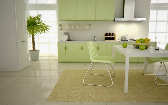
Place designer rugs under the table to help ground your colours; remember that a dining room rug should be sufficiently large so that when the chairs are pulled out they are still within the rug, rather than being half on your other flooring. This will also provide a more symmetrical look to the room.

Of course no dining table would have been complete without the most finest of cutlery being laid out in perfect symmetry and style!

Image: Vintage + Chic

Selasa, 29 Maret 2011

Contemporary Dining – An Art Form


The contemporary aspect can be completed by having some very modern vases with flowers and plants arranged accordingly, this can often make for a splash of natural colour if you have decorated you dining room in white. There is definitely an art to having a contemporary dining room, and at the end of the day you want it to be a place of comfort and relaxation, but at the same time being functional and somewhere not only you and your family can enjoy, but at those times you are entertaining guests for diner, and you want the whole experience of dining in style to be remembered.

On a note of caution it is wise to keep clear of using black as this can often enclose the room and make it feel very suffocating. Instead use colours that are associated with food, such a greens and red, you may even want to add in a touch of yellow by using a yellow rug rather than cream. There is also open to you the possibility of using some sort of texture when you are painting your dining room. Let your imagination take over for a moment and you will find that interior design ideas and inspirations will come to you far more easily, and you will suddenly find the best way to make your dining experience the warm and friendly one you want to achieve.

Image: Home Designing

Rabu, 23 Maret 2011

Be Inspired by Mother Nature


Look at the different types of textures that Mother Nature has to offer, see how serene a Silver Birch is for example and the shine of its bark could throw up many an interior design ideas to decorate your house. Look at the texture of a pine-cone and think how you could incorporate that look in a rustic way; maybe it reminds you of winter, therefore simply by adding brown rugs you can replicate the thoughts of the warmth a crackling open-fire brings.

Likewise, this season (it's now officially Spring!) conjures up thoughts of nature casting off its winter coat and springing into life with green buds giving up bursts of colour, daffodils, blue-bells and tulips provide us with vibrant colours – use these in your home as accessories and soft furnishings such as cushions and throws, rugs, ready made curtains and ready made blinds and make your home burst into new life!

Having a well balanced and well thought out room that is decorated from the inspiration that nature gives us, is perhaps one of the best themes to have going through your home, especially if you are lucky enough to live in the country, but even if you are not, you can bring the countryside in to your home where ever you live.

Image: Belle Maison

Minggu, 20 Maret 2011

Ottomans, Benches, Foot Stools

Ottomans have become a favourite of mine to use in family/media rooms and dens. I like using them for several reasons. First and foremost they serve as the indispensable coffee table. I like to make mine with tight tops and rather flat as opposed to padded with a pillow effect. This way you can set things on top of them without worrying about them toppling over. Secondly you can comfortably set your feet on them and be in a semi-reclining position to watch TV, read or maybe even fall asleep. Thirdly I can have them made any size to fit the requirements of the room. This is a real benefit because large coffee tables are hard to find. In the space below the ottoman is made out of deep chocolate brown faux Ostrich. This family has two young daughters and they use the ottoman to color on and do their craft projects and have snacks. Spills can be wiped up easily, and the deep brown faux ostrich adds and a nice textural interest and makes a dramatic center focal point for the room. Patricia Gray | Interior Design Patricia Gray | Interior Design 

This ottoman is large by ottoman standards 5 feet by 3 1/2 feet. It is covered in Holly Hunt, Hair on Hide Leather, in a creamy butterscotch color. It was made long so 3 people sitting on the sofa could all put their feet up on it, and I made it deep enough to that there was still room at the back for the inevitable books, magazines, remote controls and trays for snacks and drinks. It also doubles as extra seating for parties. What coffee table has that much versatility?

Patricia Gray | Interior Design

 Patricia Gray | Interior Design
The Ottoman in this penthouse I had made in charcoal gray Beacon Hill "Pashmina". It is soft and luxurious like a Cashmere blanket and makes a nice warming contrast to the leather sofa. It sits on top of the same color of Belgium wool area carpet. Facing the sofa is the view with the TV hung and framed between the windows. Where else do you put the TV in a room that is all windows & view.

Patricia Gray | Interior Design 

Patricia Gray | Interior Design


tufted bench1 tufted bench5

tufted bench3 tufted bench4

PATRICIA GRAY INC is an award winning interior design firm writing about lifestyle and
WHAT'S HOT in the world of interior design, architecture, art and travel.
2011 © Patricia Gray | Interior Design Blog™

Kamis, 17 Maret 2011

Interior Design Tips for Decorating A Nursery Part 2


In this post I'm going to carry on sharing interior design ideas for your baby's nursery; this time looking a colours, possible wall decoration, and window treatments.

Colours:
Colour is very important in decorating and when it comes to a nursery, you should keep the baby's development in mind. Newborns see everything in black and white while reds and yellows are the first actual colours they can perceive. You might want to avoid red and yellows, as they will kind of jump out at your baby from a what they see as a colourless room. Instead, use pastels, blues and violets in your nursery decorating attempts.

Decorating Walls Budget Style:
Are you looking for some economical options for wall art? For a few pounds, you can frame pages from your favourite childhood books. This is a simple and cost effective way to add colour, decoration and a bit of nostalgia as well. Baby blankets and quilts your child has outgrown are potential wall decorations as well. As your child grows you can use this same principle with album art and film posters.

Window Treatments:
Childrens curtains with blackout lining will help your baby sleep during daylight hours. There are a whole host of plain or patterned children's curtain fabrics online in a wide variety of gorgeous colours to compliment your nursery furnishings and colour scheme.

Decorating the nursery is an exciting endeavour for first time as well as repeat parents. There are all kinds of themes you can use from simple gender specific colour coordination to licensed character décor such as Strawberry Shortcake, Sponge Bob Square Pants and Toy Story or Shrek. Remember to choose age appropriate toys and accessories for safety sake and use furnishings that are easy to clean.

Image: Blogatlantahomesmag