Subscribe

Powered By

Powered by Blogger

Tampilkan postingan dengan label Farrow and Ball. Tampilkan semua postingan

Selasa, 01 Desember 2009

2010 Color Trends

Color Experts Farrow & Ball Create 4 Key Color Trends for 2010 

I just received the run down on the 2010 color trends from Farrow & Ball. They are all fresh and exciting combinations. I like the earthy shades in the Industrial color trends palette.  The subtle, natural colors in the Aquatic color trends palette would be dreamy in a bedroom. I especially like the dark and dramatic colors in the Urban Decay color trends palette (Pitch Black No.256 is one of my all time favourite accent colors). And how can you top the Glitz & Glamour color trends palette for adding a bit of pizzazz to a room. I would stick with the neutrals for the largest areas (Cat's Paw No.240, Savage Ground No.213,Ringwold Ground No.208) and use the brighter accent colors sparingly, maybe incorporating them in artwork and accessories.

1. Industrial 2010 Color Trends: A strong but fragile fusion of colour.

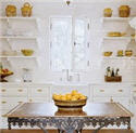
Inspired by industrial architecture, this look is all about modernity mixed with tradition. Old and new are combined in an urban palette of muted tones that mimic the earthy shades of natural materials such as stone, clay, chalk and brick. Team soft grey based neutrals such as Cornforth White No.228 and Pavilion Gray No.242 with intense and inky darks such as Off-Black No.57 and Down Pipe No.26 to create a contemporary scheme. The deep, dramatic hues are accented and uplifted by splashes of vibrant, zestful colour with citrus shades such as Babouche No.223 or Orangery No.70.

2010 Color Trends

2010 Color Trends
Key colours for the Farrow & Ball Industrial 2010 Color Trends :
Farrow & Ball Down Pipe No.26
Farrow & Ball Off-Black No.57
Farrow & Ball Pavilion Gray No.242
Farrow & Ball Cornforth White No.228
Farrow & Ball Setting Plaster No.231
Farrow & Ball Orangery No.70
Farrow & Ball Babouche No.223
Farrow & Ball Blackened No.2011

2. Aquatic 2010 Color Trends: A soft, watery palette defined by the elements.

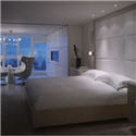
This is a gentle, tranquil scheme. Subtle, natural colours are starkly contrasted with strong inky blues and combined with the reflective qualities of light, glass and mirrors for a diluted, watery look featuring freshwater tones. Try Strong White No.2001 or James White No.2010 teamed with the soft Pavilion Blue No.252 or Tunsgate Green No.250, and underpinned by Blue Ground No.210, Drawing Room Blue No.253 or Hague Blue No.30.

2010 Color Trends 
2010 Color Trends
Key colours for the Farrow & Ball Aquatic 2010 Color Trends:
Farrow & Ball Pavilion Blue No.252
Farrow & Ball Tunsgate Green No.250
Farrow & Ball Blue Ground No.210

Farrow & Ball James White No.2010
Farrow & Ball Hague Blue No.30
Farrow & Ball Strong White No.2001
Farrow & Ball Drawing Room Blue No.253

3. Urban Decay 2010 Color Trends: A vibrant scheme with an unpredictable twist.

Bold and graphic, this look is heavily influenced by the global economic meltdown and features the strong use of vibrant colours, but with an urban edge. Team dark and dramatic colours such as Pelt No.254 and Pitch Black No.256 together in a scheme for a theatrical look and experiment with paint finish as well as colour to make a real statement. Use Eco Full Gloss to create a high shine surface and inject with zingy, bright colours such as Arsenic No.214 and Dayroom Yellow No.233 for added impact and the ultimate visual scheme!

2010 Color Trends
2010 Color Trends
Key colours for the Farrow & Ball Urban Decay 2010 Color Trends :
Farrow & Ball Pelt No.254
Farrow & Ball Pitch Black No.256
Farrow & Ball Oval Room Blue® No.85
Farrow & Ball Parma Gray® No.27
Farrow & Ball Dayroom Yellow No.233
Farrow & Ball Arsenic No.214
Farrow & Ball Great White No.2006

4.  Glitz & Glamour 2010 Color Trends: A decadent look that celebrates excess.

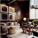
In complete contrast to Urban Decay, this look is all about wealth and indulgence. Use rich and opulent shades like Brinjal No.222, Pitch Blue No.220 and Churlish Green No.251, alongside shimmering gold and metallics for an extravagant feel. This glamorous, glitzy look has a Middle Eastern influence, so colours include exotic shades which combine and collide in a celebration of colour and excess. Try Porphyry Pink No.49, Brinjal No.222 and Churlish Green No.251; a riot of colour with an adventurous twist. Key to this look is the myriad of colours – definitely not for the faint-hearted!

2010 Color Trends
2010 Color Trends
Key colours for the Farrow & Ball Glitz & Glamour 2010 Color Trends :
Farrow & Ball Brinjal No.222
Farrow & Ball Cat's Paw No.240
Farrow & Ball Churlish Green No.251
Farrow & Ball Savage Ground No.213
Farrow & Ball Pitch Blue No.220
Farrow & Ball Porphyry Pink No.49
Farrow & Ball Cinder Rose No.246
Farrow & Ball Ringwold Ground No.208

What is your favourite 2010 Color Trends palette? 
Please let me know by leaving a comment [here].

PATRICIA GRAY INC is an award winning interior design firm writing about lifestyle and
WHAT'S HOT in the world of interior design, architecture, art and travel.
2011 © Patricia Gray | Interior Design Blog™

Kamis, 30 April 2009

15 Top Articles on Color Trends

Click on picture to go to Article.

  Reinventing Blue

  Turquoise Aquamarine Turquoise Aquamarine

 Farrow & Ball Launch 18 New Colors Farrow & Ball Launch 18 New Colors

 Beige IS Magic Beige is Magic

 The Color Purple The Color Purple

 The Best Yellows The Best Yellows

 Think Pink Think Pink

 Color of the Year - Mimosa Color of the Year

 Blue the new Black Blue is the New Black

 The Color Orange The Color Orange

 Turquoise Bliss Turquoise Bliss

 Back to Black Back to Black

 White Bedrooms White Bedrooms

 Beautiful Brown Beautiful Brown

Benjamin Moore Virtual Fan Deck Pink for Spring

Green Chic Green Chic


Patricia Gray Inc is an award winning Interior Design firm in Vancouver who blogs about Lifestyle and WHAT'S HOT in the world of Interior Design.
2011 © Patricia Gray | Interior Design Blog™

Rabu, 08 April 2009

Turquoise Aquamarine

Turquoise Aquamarine These are some of my favourite pictures I have been collecting
throughout the year of this beautiful color:
Turquoise Aquamarine
Enjoy !

Turquoise Aquamarine Dominio 
Farrow & Ball Lulworth Blue

Turquoise Aquamarine Dominio
Farrow & Ball Cooks Blue

Turquoise Aquamarine Dominio
Farrow & Ball Chinese Blue

Turquoise Aquamarine Metropolitan Home
Farrow & Ball Stone Blue

Turquoise Aquamarine
Farrow & Ball Blue Ground

The color family of Turquoise and Aquamarine has more to do with feeling and creative expression than with rational thought. These colors between green and blue the shades of turquoise, blue green and aquamarine relate to transformation, evolution, change. Aquamarine: stimulates the intellect and stabilizes the emotions, improves confidence, and the ability to stand fast, helps communication. Turquoise: supportive and protective, heals the spirit, soothing, increases contentment.

Patricia Gray writes about 'WHAT'S HOT 'in the world of Interior Design, new and emerging trends, modern design,
architecture, and travel, as well as how your surroundings can influence the world around you.
© Patricia Gray Interior Design Blog

Rabu, 19 Maret 2008

Farrow & Ball Launch 18 New Colors

Farrow & Ball Paint has just introduced 18 new paint colors in their line. I like the Farrow & Ball Paint range because it is complete yet concise. The specification of the product is very clear without too many different finishes or too large a product range to make it confusing. To use, it is just superb, like brushing silk onto the walls. The depth of colour can only be compared to silk, a fibre with a great capacity for pigment.

The product is premixed ensuring good colour matching. Every Farrow & Ball Paint colour is perfect. It is the exact shade or tint that works for a particular colour. The depth of colour and finish is way above all other paints. Every colour is a winner.

I also love the names of the colours; no other product allows you to specify ‘Drab’ and have the result be fabulous! I am especially happy to see the bottom 3 new Farrow & Ball colors: Pelt, Tanners Brown & Pitch Black and can hardly wait to try them. Wimborne White and Skimming Stone will definitely be on my list of new whites to try. I have paired some of these Farrow & Ball colors to pictures that I think might closely approximate the new paint colours in their line, so you can see how they might work in a room setting. Paint is a wonderful avenue for decorating. I always tell my clients that one colour doesn't cost anymore than another, but it can make all the difference in the world.

Farrow & Ball Paint

Farrow & Ball Paint

Farrow & Ball Paint

Farrow & Ball Paint

In rooms like the ones above I would use Farrow & Ball Paint No. 239 Wimborne White to bring out the detail in an all white space.
Photos Scott Yetman

Farrow & Ball Paint dominio

Farrow & Ball Paint No.254 Pelt - A rich plum-brown, would be an elegant and very current choice for this room.

Farrow & Ball Paint elle decor3march 2008

Farrow & Ball Paint No. 264 Cinder Rose for this room - "a fresh mauve colour" with perhaps just a little more pink in it than this picture.

Farrow & Ball Paint

Farrow & Ball Paint No.244 London Clay - the name says it all.

Farrow & Ball Paint eric piasecki photography com

Farrow & Ball Paint No.242 Pavilion Gray - a pretty light gray

Farrow & Ball Paint house beautiful

Farrow & Ball Paint No.249 Lancaster Yellow - a fresh and clean pale yellow

Farrow & Ball Paint bilhuber

Farrow & Ball Paint No.247 Terre D'Egypte - a deliciously warm red-brown terracotta

Farrow & Ball Paint jkcapri com hotel italy

Farrow & Ball Paint No.253 Drawing Room Blue - A traditional ‘salon’ blue, this colour’s clean hue is reminiscent of the pigment Cobalt,
used by artists and discerning decorators ever since its discovery in the 19th century.

Farrow & Ball Paint elle decor

Farrow & Ball Paint No.248 Incarnadine - A rich, crimson red, similar to the red gloss paint used by the late David Hicks
at Baron’s Court in the 1970s.

Farrow & Ball Paint Michael S Smith in book Elements of Style

Farrow & Ball Paint No.240 Cat's Paw - A stylish, yellow-based neutral colour which has an especially soft tone.

Farrow & Ball Paint SheilaBridges

Farrow & Ball Paint No.251 Curlish Green - A yellow-green colour has been used decoratively for centuries,
both on its own and as a ground beneath patterned wallpapers

Farrow & Ball Paint Martha Stewart

Farrow & Ball Paint No.245 Middleton Pink - A very delicate and near-translucent traditional
pale pink which is pretty without being too sugary.

Farrow & Ball Paint JefferyBilhuberInterior2

Farrow & Ball Paint No.255 Tanner's Brown - A dark, earthy brown, considered one of the most timeless of decorative tones.

Check out another post on the new Farrow & Ball paint colors at Windlost's Blog


Patricia Gray writes about 'WHAT'S HOT 'in the world of Interior Design, new and emerging trends, modern design,
architecture, and travel, as well as how your surroundings can enhance your world.
© Patricia Gray Interior Design Blog, 2009