Subscribe

Powered By

Powered by Blogger

Jumat, 31 Oktober 2008

Louis XV Commode


Designed and manufactured by Axis FormLAB this Louis XV commode offers modern twist on period furniture. Made in MDF with white gloss enamel or rainbow coloured veneer, furniture grade plywood with an oak veneer surface or acrylic it provides an unusual and stylish way to display wine and serve drinks.

Louis XV commodes are traditionally flamboyant and ornate wooden cabinets with doors or drawers which are adorned with inlays, gilding or elaborate carving. Axis Form LAB have taken the overall basic shape and included the curved lines to produce an stylish and practical piece of furniture. The classical style and chic appearance make this commode perfect for ‘des res’ (desirable residence) homes of both traditional and contemporary design depending on which material is selected. The MDF and plywood versions are more in keeping with traditional or modern homes, while the transparent acrylic model is the ideal choice for contemporary homes.

Wine cellars are definitely a thing of the past, with the ‘in vogue’ custom of showing off your wine stock this Louis XV commode serves the purpose wonderfully, while also incorporating a much needed serving surface for informal snacks and nibbles. The one open side is ideal for storing glasses or displaying unusual shaped and coloured bottles of liqueurs or adding personal touches by displaying ceramic or glass dishes.

I am somewhat amused by the term ‘commode’, although it does refer to a chest of drawers, in the UK a commode is also the term given for a lidded seat which houses a chamber pot underneath!

Image source: www.axisformlab.com

Rabu, 29 Oktober 2008

Mirror Magic

Not much has been written about the merits and sheer magic of using mirrors as focal points and works of art in rooms. So I would like to dedicate this post to the beauty, genius, and magic of mirrors. Everyone has either seen or heard of the famous Hall of Mirrors in the Palace of Versailles, built by Louis XIV in 1678. The principal feature of this famous hall is the seventeen mirror-clad arches that reflect the seventeen arcaded windows that overlook the gardens. Each arch contains twenty-one mirrors for a total of 357. In the 17th century, mirrors were among the most expensive items to possess and at the time and the Venetian Republic held the monopoly on the manufacture of mirrors. The expense in manufacture of mirrors has come a long way since those days.

Mirrors over fireplaces:
One of the places in a home most adorned with a mirror, other than the bathroom, is over the fireplace. It is the perfect focal point in a room to strategically place a mirror. Depending on the room and the orientation of the fireplace, a mirror hung over the fireplace can reflect other important areas of the room and create drama and atmosphere. In the living room below I used a laser cut mirror above the fireplace, which echoes the filigree pattern in the framed wallpaper panels on either side of the fireplace. I painted the wall behind the mirror a deep chocolate brown to further define the edges of the mirror. The curtains are the same rich chocolate brown color and are made of silk taffeta which further adds to the shimmery effect at night.

Patricia Gray Inc 

Mirrors in Bathrooms:
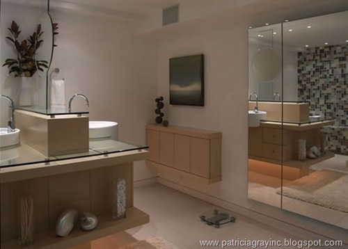
Bathroom mirrors come in every size and configuration. In my designs I try to come up with something unique, while still being very functional. In this bathroom my client wanted a 3 Way mirror. So handy if you want to get a 360 degree view of yourself. The mirror over the vanity is double sided circle, that echoes the shape of the matching back to back sinks. The mirror is attached to the ceiling and to the vanity at the top and bottom with clear glass.

Patricia Gray Inc 

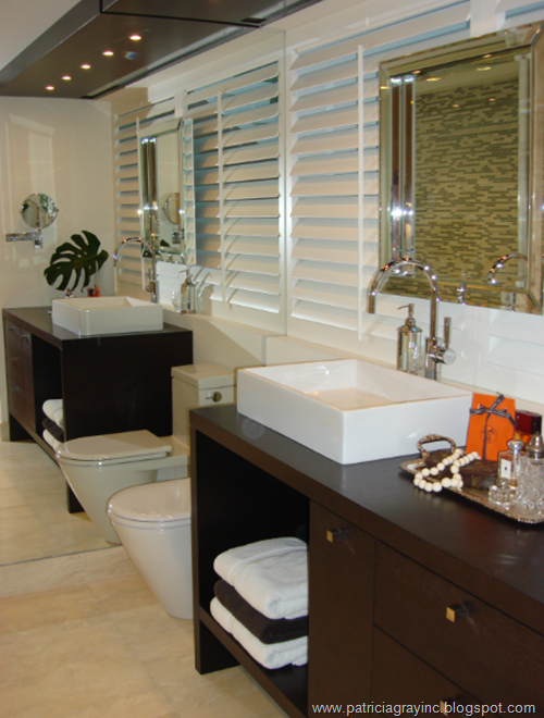
What do you do if you have a window in front of your vanity? Below in my own bathroom I used California shutters for the window covering. I love the look and feel of California shutters. I designed the room so that the sink was centered on the length of the window. I had the stile of the shutters made to line up perfectly with the center of the sink, then I had my glazier design a special mounting that would allow the mirror to be attached to the stile, while still allowing the shutters enough space behind the mirror to open and close. The mirror appears to be floating in front of the shutters. 

Patricia Gray Inc


Mirrors in Dining Rooms:
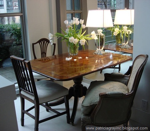
This is a picture of the breakfast area in my own home. The mirror helps to enlarge this small space and bring in the view of the garden. By placing a lamp on the table in front of the mirror it creates the illusion that the room continues. The lamp also creates some drama and makes it a cozy spot to sit and linger in the evenings. You can read more here, where I talk about my Lucite lamp and mix of chairs.

Patricia Gray Inc 

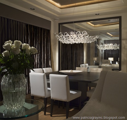
The mirror I designed and had built for my client's dining room. It perfectly reflects the magnificent Murano glass chandelier hanging over the custom built large square dining table. It also captures views of the adjoining living room for people that are sitting with their backs to it. When you are making mirrors this large make sure that they will fit through the front door. I made that mistake once and that was enough to learn a very valuable lesson: check and double check every detail!! If it still won’t fit, I have the mirror made on-site. The draperies are made of chocolate brown silk taffeta with a padded valance, the ceiling inset is lit around the perimeter and painted with gold leaf.

Patricia Gray Inc 

Mirrors in Bedrooms:
In this bedroom I placed a full height mirror for the client to use as a dressing mirror.

Patricia Gray Inc 

PATRICIA GRAY INC is an award winning interior design firm writing about lifestyle and
WHAT'S HOT in the world of interior design, architecture, art and travel.
2011 © Patricia Gray | Interior Design Blog™

Ink Art Work


I firmly believe that the most successful interior designs are those which not only work extremely closely with the client in terms of finished appearances but also include personal preferences and interests to ensure that individualism is incorporated skilfully within the agreed designs and styles.

For me this piece of intricate ink work displays a passion for using tattoo artistry which clearly demonstrates the ability of the artist to the full. Hand tattooed by Mama Tried studios directed by Scott Campbell, the team at Mama Tried has adopted a ‘why didn’t we think of that’ philosophy in producing exciting and unorthodox approaches to visual media.

The new series of the successful TV programmes London Ink and Miami Ink shows that many, many people are using tattoos to decorate and bring art to life on their bodies. This striking chair with its retro black ornate frame, cream leather seat and back rest tattooed in black ink will bring much pleasure to those who adore this type of artistry and a bold way of life. The trendy skull design used as the main focus has a haunting appeal, daring someone to take a seat!

Undoubtedly this chair will not appeal to everyone’s taste, however, I do feel that it would make a striking focal point when incorporated within a room which has taken client personality and individualism seriously. I’m sure many a discerning tattooist would jump at the chance to include this unorthodox chair in their workplaces to provide an unusual and unique method of promoting their profession effectively.

Image source: www.decojournal.com

Selasa, 28 Oktober 2008

Roller Blind Revival


I have to admit that I have always liked the concept of using a roller blind as part of a window treatment in both traditional and modern home interior designs.

Roller blinds are an extremely practical way to provide the maximum amount of natural light entering a room as when rolled up they expose virtually the entire window, offering unobstructed views of the outside world. At night roller blinds provide essential privacy in the easiest of operations.

New designs of digital images on roller blinds, which can be made into any size, have given the humble roller blind a whole new lease of life for me. Striking images seem too good not to be see during the day, part pulled blinds compensate this very well and yet still enable light to flood into a room.

Roller blinds need not be confined to a bathroom or kitchen, the functionality and versatility of a blind makes them perfect for using with both contemporary and traditional curtains.

My love of the roller blind has definitely been re-kindled with the range of blinds available from Noodle.

Noodle launched their new range of blinds at this years 100% Design Exhibition with digitally printed Pink Nerine. The natural vibrancy of the colours and clarity of the images present these blinds as works of modern window art in a very exciting way for me.

With over one hundred different designs in the Noodle range, there is a colour and image to suit all homes. Noodle can also produce truly unique blinds using client’s own images to add a real personal touch to a room.

Image source: www.100percentdesign.co.uk

Jumat, 24 Oktober 2008

Inject a Riot of Beautiful Colours into a Home


Digital images skilfully designed into a range of cushions by Noodle will inject a riot of beautiful colours into a home. The variety of different images which capture nature at its best are digitally printed onto silk fabric and come complete with a feather insert.

The traditional style square shapes are available in either 16 or 20 inch with the rectangular panel cushions in a generous 11 x 18”, all are machine washable making them extremely functional as well as striking to look at.

Noodle have their own on-line shop with many of their products available ready to buy rather than ordering and waiting for them to be made. The wide choice of traditional favourite flowers in vivid natural colours provide something to suit all colour decors. The stunning effects of the close up images and vibrant colours are perfect for instantaneously injecting colour into a room.

The autumnal leaves and branches in burnt oranges or sunset reds offer a warm appearance just waiting to be snuggled into during the winter months. One of the great advantages of using cushions in a home is the versatility to replace the covers in line with the seasons, alternatively brighten the winter blues by choosing spring or summer flowers reminding us that winter doesn’t last forever!

With Christmas just around the corner, I believe I have found the ideal gift for all horticultural lovers, green-fingered gardeners or those who love nature at its best! With such a vast range available it’s just a matter of selecting which ones to opt for!


Image source: www.noodleonline.com

Kamis, 23 Oktober 2008

Big Bar Lake

My Associate Interior Designer and CAD Technician extrodinaire, Carole Root, has just come back from a fishing weekend at a cabin set on Big Bar Lake.  Big Bar Lake is situated in the High Country Region (or as it is commonly referred to as "The Cariboo") of British Columbia and is located north of Clinton and west of 70 Mile House.  It is some of the most beautiful countryside I have set my eyes on. The weather was perfect autumn days when the colors are magnificent, crisp and clear.  I can almost smell the lake and the freshness of the air when I look at these pictures.  How wonderful to be out in nature, truly away from it all.  Below are some of the pictures Carole took with her new camera, a  Canon Rebel XSI.  I hope these pictures are as much a feast for your eyes as they are for mine.  Thanks Carole.  Enjoy..........

BigBarLk Sunrise
Big Bar Lake Sunrise (that is the moon still visible in the sky)

BigBarCreek
Big Bar Creek

Aspen
Aspen

BullRush
Bull Rush

Bush
Bush

Grass
Grass

GreyBird
Gray Bird
Post Script Oct 30 2008   Gray bird photo is actually a Gray Jay otherwise known as a Whiskey Jack. What's in a name? Well our First Nations people knew this creature as "wiss-ka-tjon" or "wis-ka-chon". In the old-time lumbering days the Jay would visit the lumberjacks in the northern forests of Canada. In turn, the lumberjacks shared their grub with it and came to call it "Whiskey-Jack". Now the bird's modern "common" name is "Gray Jay" or "Canada Jay"(and its scientific name is Perisoreus Canadensis).

JackPine
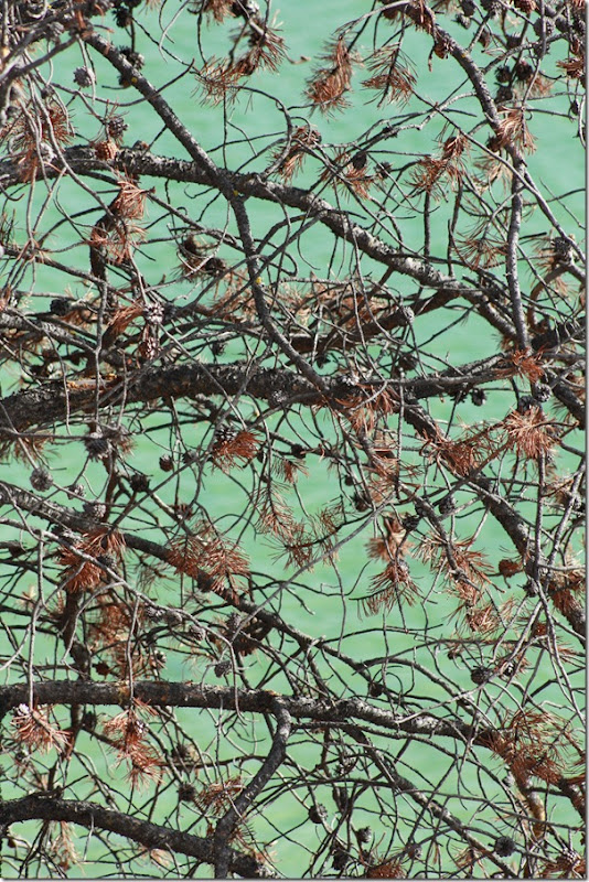
Jack Pine

trout&rod
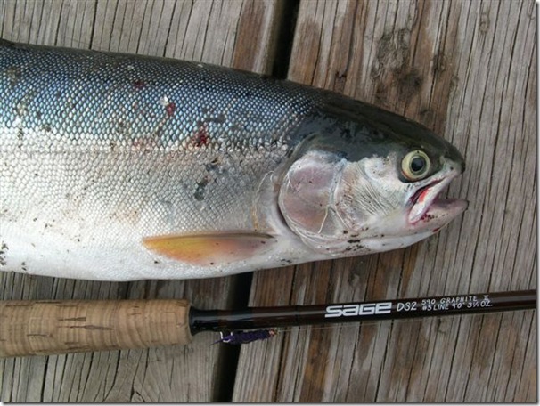
Trout & Rod

BigBarLk Sunset
Big Bar Lake Sunset

Patricia Gray writes about Interior Design inspirations, emerging trends, and the world of Design. 
While you're here, subscribe to this feed so you don't miss out.

Rabu, 22 Oktober 2008

Black and White or White and Black?


I adore these coffee tables made in fabric, PU or leather. The monochrome effect is striking in an understated way, the pattern is inspired by natural objects which have been placed ingeniously around the base, providing a style which would look stunning in a variety of different hone or office interior design styles.

The Buono-coffee table was launched and exhibited by PimPen.Co.Ltd at the 100% Design Exhibition in September this year and is designed to be both a coffee table and a stool. This piece look incredibly comfortable as a stool, just perfect for perching on informally! I can also see this table being used as a foot stool, a contemporary twist on the traditional pouffe in many homes.

The circular insert lends itself beautifully for placing a mug of coffee during the day or a glass of wine at informal gatherings or a quiet night in by the fire! The practicality of incorporating this piece of modern furniture into homes I believe are endless, although they have been made as part of the Buono collection of seating they would look equally striking coordinated with people’s existing furniture suites, more particularly if they are also in plain black or white fabric or leather.

Chic and sophisticated the Buono-coffee table has an unfussiness which I really enjoy, stylish yet functional and exceptionally pleasing to the eye with no harsh rigid lines one’s attention remain focused on the coffee table. For me, either colour way, black and white or white and black is reminiscent of Ying and Yang, balance and harmony.

Image source: www.100percentdesign.co.uk

Selasa, 21 Oktober 2008

The Ultimate in Recycling?


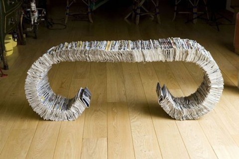
This has bench has got to be one of the most innovative designs in ultimate re-cycling! The “334” bench is made strangely enough from 334 old newspapers which have been folded and stacked next to one another on three parallel bars of metal. The design shape and number of newspapers provides the bench with enough strength to hold five people.

Not only is the “334” bench extremely economical and an excellent way to re-cycle it has a design shape which is simplistic yet proportional, suiting all manner of interior design styles.

Created by Oscar Lhermitte, product design student at the central Saint Martins College of Art and Design, the “334” bench is part of his 'X Days Project', the concept behind the “334” bench has been used to inspire people into recycling and creating their own unique and fascinating pieces of furniture and useful objects without using glues or screws!

I think this type of effective and practical re-cycling should be encouraged in schools as part of 'going green' campaigns. I suppose for those who wish to be annoyingly pedantic one could only use the newspapers one reads! Saving a daily newspaper, a bench could be successfully completed within a year and the colour supplements could be created into coordinating coffee tables!

I'll be interested to know how well this fantastic idea catches on and whether it will only people who read certain newspapers actually give it a go! Of course there is bound to be the dilemma of where to store a years worth of newspapers somewhere dry while or maybe it should be an ongoing project which gradually evolves over the days and weeks!

Image source: www.woohome.com

Sabtu, 18 Oktober 2008

Tom Raffield- Ash Pendant No.1


Tom Raffield, co-founder of Sixisis, has created his own company from which he has used the most beautiful local English Ash to create this unique sculptural light shade.

A piece of true craftsmanship which looks as stunning during the daylight hours when natural light permeates through the coils and woven twists as it does when the energy saving soft glow giant light bulb, which Tom supplies with every commission, is switched on. The visual effects highlight the natural colouring of the wood magnificently while offering a soft, subtle lighting effects.


Tom is renowned for his designs using sustainable woods. To create the light shade he steams green, unseasoned wood to provide him with the flexibility to bend, coil and weave the strips into this fabulous design. His low energy manufacturing methods are truly remarkable, he uses only water and local wood, any wood waste goes to a local smoke house to cure fresh salmon and mackerel.

I really like this piece of practical sculptural art. This particular piece has a 60cm diameter, however, different sizes will be made on request, contact@tomraffield.com

I believe Tom has costed his work at low prices, Ash Pendant No.1 is only £250, making he work very affordable as well as genuinely unique.

As Tom has called this Ash Pendant No.1 I sincerely hope he is going to produce numbers two and three very soon!

Ash pendant No.1 was recently unveiled at Liberty of London and is currently available to see at the Re Design Lighten Up travelling Exhibition which began in September this year.

Image source: www.tomraffield.com

Minggu, 12 Oktober 2008

In Conversation with Patricia Gray

Meade Design Group - The Blog

The following interview was graciously done by Ivan Meade who is an Interior Designer in Victoria BC.  He writes the 
Blog Meade Design Group.  I was so pleased and surprised when a beautiful orchid arrived by special delivery at my door
following Ivan's posting of his interview with me.  The note on the orchid said "Thank-you so much for the Interview" Ivan Meade. 
I am so honored to be interviewed by Ivan.  He has done interviews with other Designers that I admire.  Some of the interviews
you can read on his Blog are with:
Barbara Barry
Vicente Wolf
Thomas O'Brien
Kenneth Brown


In Conversation with Patricia Gray

Patricia Gray

Patricia Gray is an award winning, highly recognized interior designer from Vancouver, Canada, who finds time in her
busy schedule to update her interior design blog almost daily! and I know how hard this is. Her blog features her inspiration,
including other designers and architects that she admires not to mention sneak peeks of her stunning work. She has been
published in Architectural Digest, House and Home, Style at Home, Western Living along with other notable magazines.

Iván Meade - What was your first experience with design?
Patricia Gray - When I was 5 years old I remember rearranging the furniture in the Living Room.

Laurel Residence

Photograph courtesy of Patricia Gray

Iván – A client of mine sent me a link of your blog a couple of days after I launched my own blog last November – I have
to say that I still have a lot to learn . What does it mean for you to blog your ideas in design, your travel experiences and
basically open your personal life to the web?
Patricia – I started Blogging basically as a personal journal to record and catalog my inspirations. I thought it would be a
good forum to express myself outside of my professional practice as an Interior Designer. It has now taken on a life of its own.

Iván - What has been the best experience of being a design blogger?
Patricia – The other bloggers I have met all over the world. It is quite a network. I have made friends in Morocco, Houston,
New York. My readers are from all over the world and are very sophisticated and savvy. They keep me on my toes.
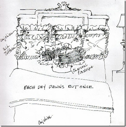
ash street bedSketch by Patricia Gray

Photograph courtesy of Patricia Gray

Iván – Your interiors definitely celebrate restraint and order. To what/whom do you owe this influence?
Patricia – My Professor, Terry Kutcher ,when I was a student in Design School inspired in me a love for design.
He was meticulous in criticizing all my designs and floor plans. I learn to edit, to be selective, and to create rooms that had
a focal point and were unique.  I was also very influenced in my formative years of study by the fabulous Michael Taylor, who
was at the time creating designs that were new and innovative and were totally suited to the times.

Gastown Project
Photograph courtesy of Patricia Gray

Iván – There is an European influence in your timeless interiors, they are not just beautiful and contemporary, but they are
also very livable. How do you archive that?
Patricia – Part of the European influence I think comes from the time I spent studying Interior Design in Paris. It is very
important for me to create spaces that are comfortable, functional, and beautiful. I make sure that when you enter a room
you feel comfortable, when you sit down you have an experience with the space you are in and that you have beautiful things
to feast your eyes on.  Editing is an important part of the process for me, because if you have too many things in a room, you
don’t appreciate any one thing in particular. Also important in editing is the details. They have to be executed to perfection.

Gastown Project
Photograph courtesy of Patricia Gray

Iván - It’s the big installation day. What could have gone wrong did go wrong. How does Patricia Gray deal with that?
Patricia - You deal with one thing at a time. It is also important to work with a good team that are each experts in their
field.

Gastown Project
Photograph courtesy of Patricia Gray

Iván – The popularity of the design shows on TV has brought interior design into homes all across our country. If you had a
show, how would you educate the viewers about interior design?
Patricia - That’s a big question. Design is a process and involves many steps to get to the end. I think that a lot of the detail
of this process is left out in the current shows. In a 30 minute show a home is completely finished. I think it would be educational
to follow a project week by week to completion.

Laurel Residence
Photograph courtesy of Patricia Gray

IvánA decor fad you hope never to see again?
Patricia – Well, I hoped that I would not see a revival of the 80’s, but it is upon us now. I am now really starting to appreciate
it again in a fresh new way. For example the resurgence we are seeing in the use of wallpaper. I still have clients that cringe
when I say the word wallpaper because they lived through it and the horrors of having to remove it from walls that were not
properly prepared for it.  We go through phases in design and I think we become saturated, so we change and move on, then
a new generation comes along and loves the things of the past and breathes a new life into it.

South Granville Project
Project Photograph courtesy of Patricia Gray

Iván – You recently returned from a design course in Italy, what was that experience like and what is next on your design
journey ?
Patricia – I spent a month in Italy studying Contemporary Italian Architecture. It was an amazing experience. I lived in a dorm
and rode a bicycle to classes in the most Beautiful Medieval walled city. The Italians have an appreciation for Design that is in
their blood. It permeates everything in their lives. For my next experience I want to spend some time in Belgium. Some of the
top design in the world right now is coming from this country.

Laurel Residence
Photograph courtesy of Patricia Gray

Iván - Any words of wisdom?
Patricia – Take your time to make purchase decisions for your home. Buy fewer thing of better quality. Have only things
around you that you love!!

Yaletown Project
Photograph courtesy of Patricia Gray

Iván - Lastly, you have already created a stunning body of work with many mediums and styles, what would you like your
legacy to be?
Patricia – That I created spaces that were memorable, stimulating to be in, and stand the test of time.

To see more work of Patricia Gray please visit:

www.patriciagrayinc.com
www.patriciagrayinc.blogspot.com

Posted by MEADE DESIGN GROUP